Hello
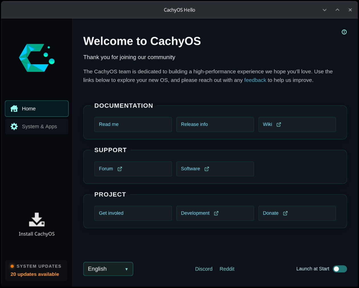
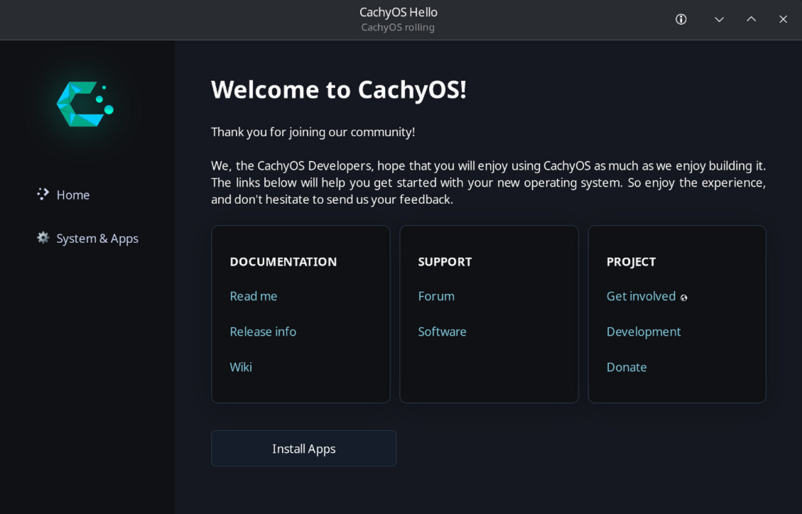
By way of background I do web design/front-end and digital marketing, based in Brisbane Australia. I have been playing around with a re-do of the ‘CachyOS Hello’ app from a design and UI perspective.
I have two versions, Tauri and the current Glade UI.
Tauri - Quicker build with HTML/CSS and additional functionality with ‘System Updates’ card, left nav, install button. Tauri approach is more resource intensive, I have about 70% working functionality.
- Modal (for Read me etc)
- System & Apps (replaces Apps/Tweaks) and further expands it out into detailed sections
Glade - CSS is more limited, and still working on styling, using original version as basis so it is fully functional.
- Home
- Read me page
- System & Apps (loads Apps/Tweaks) - WIP
See additional screenshots, was not able to post as I am a new member.
Any thoughts, criticisms? is the styling too much?
I like (Tauri)! But….
By way of background, I do back-end development based in Wellington, New Zealand 
So take what I say with a pinch of salt as I know I suck at UI design, but what would the welcome screen look like if buttons were just a single-column list of links? I like the overall look and layout, but my eyes end up scanning the whole screen , instead of just following a list down.
Other than that, my only other criticism is that you’re Australian 
P.S., send this to any Kiwi workmates you might have: https://www.youtube.com/watch?v=7xUYbI64QHI
I like Tauri, it is fun to work with.
Not too sure with single column, like a mobile layout? Do you have an example? Or each section as single column
(glade)
p.s. Also I am dual citizenship with NZ, so I’ll only accept half of the criticism 
I never saw this ui before
Nice, I find that easier on the eye; again, less moving about. No particular layout, I just always felt that a link indicated that it wound take you somewhere, and a button indicated that it would do something on that page. It’s mixing UI metaphors (nope, still cannot spell that).